


Officer 2nd Class Thomas M. Blue
Burt has gathered evidence about one of three technologies commonly used to clean up oil spills. He is solving a big problem by breaking it into smaller parts. Now he needs to make sense of the part he is working on. That is, he needs to explain the evidence he has just collected. If he can explain it to himself, then he can explain it to his boss as in figure 3-10. Maybe then Burt won’t feel like things are impossible.
In this Explain activity, Possible versus Impossible, you will learn one way to make sense of evidence. This involves deciding when something is possible versus impossible. You will use evidence that comes from the Explore activity, Recovery Time. Once you make sense of the evidence, you will practice explaining the evidence to Burt’s boss. In the next activity, you will expand your problem-solving skill to other oil spill technologies. Materials
-
Set a Recovery Time Graph master in front of you. Prepare to plot the class averages by
- reading the title and units for each axis
- placing your data sheet with class averages to the left of your graph
- making sense of the numbers and scale on each axis.
-
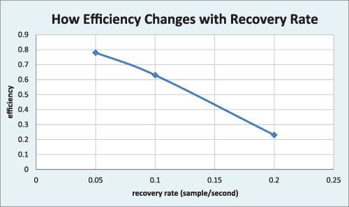
Plot the class averages for the independent variable (recovery rate) and for the dependent variable (efficiency). Check your graph with classmates near you. Resolve any differences, using evidence and logic.
-
Follow your teacher’s advice to make the best fit curve through your data points.
-
Interpret your graph by completing the following statements.
- What I see is a downward-curving line going from high _________ and low _____ to ________ and __________.
- What I think this means is that as rate of removal _____________, efficiency of removal _________________.
Place these completed statements on your graph very near the curve you made. Hint
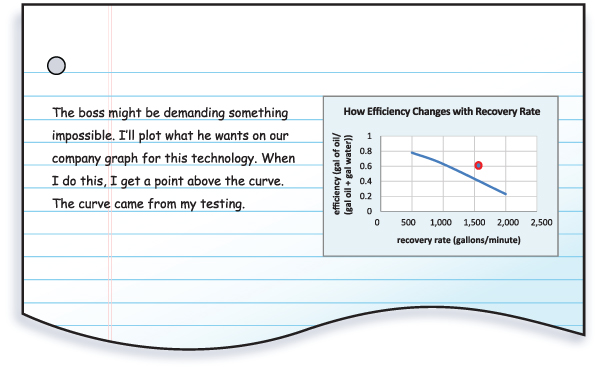
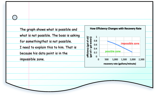
Read Burt’s notebook notes. In them, he used his company’s test data from technologies they sell. Burt represented his boss’s demands on a graph. Then Burt explained what he saw.
Use Burt’s notebook notes to explain why his boss’s demands are impossible. Include the following parts in your explanation:
- A claim about whether the demand is possible or impossible
- Specific evidence or example numbers that support your claim
- A reason the trend shown in the graph links your claim and evidence. Hint
Use your work from Step 6 to construct another explanation. Explain your graph from Step 4. It is the graph you made from the Explore activity data. Your explanation will have three parts:
- Claim
- Evidence
- Reason.
Notebook Notes
Activity Overview
In this Explain activity, Possible versus Impossible, students read field notes by Burt, the engineer, from the Engage and Explore activities. These notes show a worked-out example of how to make sense of a recovery rate (sampling rate) versus a recovery efficiency graph. Students use this model to construct an explanation for their data from the Explore activity. Student mental effort is mostly directed to making sense of evidence and explaining it with a graph and with words.
Before You Teach
Background Information
Line graphs are a way to show relationships between two sets of numbers. Often, these numbers are the measurements of the variables in an investigation. Variables are the factors that change or vary in the investigation. Line graphs can show the relationship between the variable you change in the investigation and the variable that responds to that change.
The variable that changes in an investigation is called the independent variable. You may have heard it called the manipulated variable. The dependent variable is the one that responds to the changes that were made. This is sometimes called the responding variable. This variable “responds” or “depends on” the changes that are made.
Imagine an investigation where someone wants to see how the amount of water a plant receives affects its height. The independent variable is the amount of water because the person will be changing that amount. The dependent variable will be the height of the plant because the height it grows to depends on the amount of water.
In a line graph, the independent variable is usually plotted on the x-axis, or horizontal axis. The dependent variable is plotted on the y-axis, or vertical axis. Sometimes, the independent variable in an investigation is time. You might be interested to see how a plant grows over time. In this case, even though you are not manipulating that variable, it is the one that is changing. Time would be plotted on the x-axis of a line graph.
Materials
For each student:
- 1 copy of Master 3-2, Recovery Time Graph
Advance Preparation
Make a copy of Master 3-2, Recovery Time Graph, for each student.
As You Teach
Outcomes and Indicators of Success
By the end of this activity, students will
-
graph recovery rate as a function of recovery efficiency.
They will show their ability by
- confirming the scale and title of each axis
- calculating and plotting class averages for recovery rate and efficiency
- drawing a best-fit curve through data points.
-
be able to make sense of the recovery rate versus efficiency graph.
They will demonstrate what they made sense of by
- completing statements about what they see on the graph and what it means
- using a model explanation to explain an engineer’s field notes
- transferring what they learned from the model explanation to explain their graph.
Strategies
Getting Started
Ask students to close their eyes and to think about a situation where they felt confused—maybe they did not understand the directions for a task, or maybe something unexpected had occurred. Give them examples from your life, such as your first experiment in science class where you couldn’t figure out how to light the Bunsen burner, or the time you couldn’t solve a simple brain teaser that everyone else thought was easy. Ask them to share their stories and the way they felt.
Then ask how they felt in a situation that was very clear and understandable. Have they ever had a situation where they did not understand something, but then they figured it out? What did they do to figure it out? How did it make them feel once they had figured it out? Connect their good feelings to Burt. He wants to make sense of the data from the Explore activity. You can give a name to this sense-making process—it is an explanation. Tell students that engineers explain their work in specific ways. Explaining is the focus of this activity.
Process and Procedure
-
Orchestrate this step by modeling exactly what you want them to do physically. Use a think-aloud strategy to review each feature of the master. The idea is to model how you (an expert learner) monitor your thinking. You will model how engineers make sure they understand all the features of an empty graph before they begin plotting data.
-
Decide whether the whole class needs instruction regarding plotting x-y values. If not, then work with teams that are struggling. Do not let them simply connect the points.
-
Display the graph of class averages to the entire class. Use butcher paper, an overhead projector, computer screen projection, or a white board. A best-fit line for middle school students is a visual average of the trend. Draw a curve that gets close to all three x-y points. The curve will likely not touch each point. An example best-fit curve for the data reported in the Explore activity is found in figure T3-5.
-
Remind students that engineers take two basic steps when interpreting graphs. First, they describe what they see. Second, they try to determine what their observations mean. They do not jump directly to interpretations. It is important to slow down student thinking by having them state what they see first. Then they can link interpretations to evidence. Review the answers to the blanks before proceeding to Step 5.
- What I see is a downward-curving line going from high efficiency and low recovery rate to low efficiency and high recovery rate.
- What I think this means is that as rate of removal increases, efficiency of removal decreases.
-
This reading is short, but conceptually dense. There are a lot of ideas in a few paragraphs. Students must use the narrative as a guide to interpreting the graphs. This means they will have to pause frequently as they read and glance at the graph that is being discussed. Students may not be used to this. Model this by showing how your eyes physically move from text to graph as you try to make sense. Emphasize to students that making sense is an ongoing process, not something that happens only at the end of the reading.
-
Reasonable responses to the parts of Burt’s explanation are below. The intention is for students to repeat the explanation in the reading, but in a paraphrased and shortened way.
-
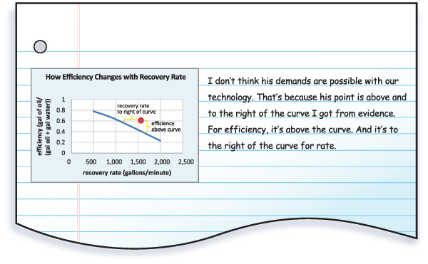
A claim about whether the demand is possible or impossible
The boss’s demands are impossible.
-
Specific evidence or example numbers that support your claim
The boss demanded a recovery rate of 1,600 gallons per minute and an efficiency of 0.6. This plots to a point that is above the trend line obtained from our test data.
-
A reason the trend shown in the graph links your claim and evidence
When a point is above this trend line, it is impossible to accomplish. This is because the rate is higher than is possible for the efficiency the boss wants.
-
-
This step provides an opportunity to practice constructing an explanation. Students explain the data from the test they conducted in the Explore activity. Ask them to use what they learned from explaining Burt’s graph. Caution them that their data is not exactly the same as Burt’s.
-
Claim
Alternative 1: I claim that above and to the right of my best fit curve is the impossible zone and below and to the left is the possible zone.
Alternative 2: I claim that recovery rate and efficiency are inversely proportional (one goes up and the other goes down).
-
Evidence
Alternative 1: The evidence for my claim is that a recovery rate of .15 samples per second and efficiency of .7 is to the right and above the actual test results.
Alternative 2: The best-fit curve slopes down and to the right.
-
Reason
Alternative 1: The trend line results from actual tests of real technology. Any point to the right and above the curve exceeds the ability of the technology. That makes this impossible to accomplish.
Alternative 2: Inverse relationships are ones that move in opposite directions. That is what happens with recovery rate and efficiency. Thus, this relationship is inverse.
-