


Garbage has changed over the years. Not only has the type of garbage changed but also the amount of garbage. Can you think of some reasons why? In the United States and some other countries, our current pattern is to throw away large quantities of garbage every day. In fact, in 2008 we threw away 250 million tons of trash. That is enough to fill more than 1,000 professional football stadiums. How much garbage do you think we produce compared to people who lived at other times? In this Explore activity, Garbage through the Years, you will work to find out how Americans today compare to people in the past. Materials
-
Set up your technology notebook for a new activity. Then turn it to the landscape orientation. Get a copy of Master 1-1, Waste Generation Rates. Cut out the graph, including all labels and the legend. Tape or glue it in your technology notebook as shown in figure 1-3. Hint
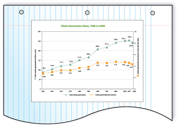 Figure 1-3: A technology notebook with the graph attached. Turn your notebook to the landscape orientation. Cut out the graph, then attach it in your notebook in the position shown.
 -
Use the Highlight Comments and Caption strategy to analyze the graph. To use this strategy, follow Steps 2a–d.
- Draw arrows to any changes, trends, or differences you see on the graph. Try not to write in your notebook to the left of the graph. You will need to write in this area in a later step.
- Next to each arrow, write the statement “what I see.” Then add a comment that describes what you see. Hint
- Below each What I See statement, write “what it means.” Then add a comment that describes what you think that change, trend, or difference means.
- Add a caption in your technology notebook and label it “caption.” Remember not to write in the area to the left of the graph. The caption should link all of your What I See statements and What It Means statements. A caption is a summary of the whole graph. Hint
-
Answer the following questions about the graph.
- At what year does the data on the graph begin?
- Has the total amount of waste produced since that time increased or decreased?
- Has the amount of waste produced per person since that time increased or decreased?
-
Add a line to the graph to show what you think has happened to the number of people in the United States since the beginning of the graph. Draw your line above the line for the total amount of garbage produced. Hint
-
Imagine that the graph extended back to the year 1890. Make a prediction about how you think each of the three lines would appear between 1890 and the starting point on the graph. To do this, use colored pencils to extend each line back from where it starts. You may also want to extend the x-axis.
-
Join with three other students to make a team of four. Decide which reading each of you will do. The readings are:
- The 1930s
- The 1890s
- The 1500s
- Ancestral Puebloans (pronounced pweb LOW ans) in 1200.
-
Get a copy of your chosen reading. Read the information. As you read, underline any information that helps you think about the amount or type of trash produced during that time.
-
Share the information from your reading with your teammates. Listen carefully as your teammates share their readings. As you listen, think about whether the people in your teammates’ readings produced more or less trash than the people in your reading. Also consider differences in the types of garbage and how people disposed of it.
-
With your teammates, discuss how the amount and type of garbage has changed over time. Also discuss the changes in how people disposed of their garbage. Write down any patterns you notice related to garbage over the time periods you studied.
Activity Overview
Students begin by analyzing a graph that shows the amount of garbage people have thrown away in the last few decades. Students then think about how the population of the United States has changed during that same time. Students read different scenarios about people and trash from the past. They again think about patterns related to garbage disposal and compare the amount they throw away to the average amount Americans throw away.
Before You Teach
Materials
For each team of 4 students:
- 1 garbage bag (optional; see Advance Preparation and Getting Started)
- garbage from a 24-hour period (optional; see Advance Preparation and Getting Started)
- balance (optional; see Advance Preparation and Getting Started)
- 4 copies of Master 1-1, Waste Generation Rates
- 2-4 pairs of scissors
- glue or tape
- pens or pencils of different colors
- 1 copy of Master 1-2, Scenarios from the Past
Advance Preparation
Make copies of the masters needed for this activity. Each student will need a copy of Master 1-1, Waste Generation Rates. For Master 1-2, Scenarios from the Past students will be working in teams of four and will each read one scenario. For this reason, these copies should be single sided. Each team will need one copy of Master 1-2 because it includes all four scenarios.
Read the Getting Started section and decide if you would like to use that as your opener. If so, collect the garbage you would throw away in a 24-hour period. Place the trash into the garbage bag. When you begin class, you will want to weigh the garbage in the bag, so ensure that you have a balance that is able to hold the weight of the garbage and bag.
As You Teach
Outcomes and Indicators of Success
By the end of this activity, students will
-
practice analyzing the important information on a graph.
To practice this skill, they will
- complete the Highlight Comments and Caption strategy on the graph
- answer questions about the graph.
-
discern patterns about garbage disposal over time.
To discern the patterns, they will
- describe a scenario to their teammates
- discuss the amount and type of garbage produced by the people in the scenarios
- describe patterns they see related to trash in the time periods they examined.
-
describe the reasons garbage disposal has increased over time.
To describe the reasons, they will
- discuss their ideas about patterns and types of trash over time
- answer questions about why they think the amount of trash has increased.
Strategies
Getting Started
One way to begin this activity is to collect your own garbage over a 24-hour period. Gather the trash in a garbage bag. Ask students if they think they threw away more or less than what you have gathered. When students have completed Step 2, weigh the bag and see how the amount compares to the amount the average American throws away.
Process and Procedure
Students should turn their technology notebooks to the landscape orientation. Have them use a new page. Distribute copies of Master 1-1, Waste Generation Rates, along with scissors and tape or glue. Students should attach the graph to the upper right portion of the page.
-
Have students use the Highlight Comments and Caption strategy to analyze the graph. If your students are not very familiar with this strategy, or if they need additional help, refer them to the How to Use the Highlight Comments and Caption Strategy handout. (The teacher version of the How to Use the Highlight Comments and Caption Strategy handout can be found at this link.) Tell students that they should analyze each line separately as they complete the strategy. Have them write comments and their caption to the right and below the graph. They will need the space to the left of the graph in Step 5. Some students may find this graph difficult to read. If this is the case, go over some of the aspects of the graph with them. They should note the following important information:
- The two lines represent the total amount of waste generated over time and the amount of waste generated per person over time.
- The two lines use different scales. The scale for the total amount of waste is shown on the y-axis on the left side of the graph. The scale for the waste generated per person is shown on the y-axis on the right side of the graph. The symbols on the axes help students see which line goes with which scale.
You may also wish to share with your students that the graph includes both trash and materials that were recycled as waste was generated. At this point, if you began the class with garbage you collected over 24 hours, tell students that you should see how much your trash weighs. Use a balance to measure the weight of the trash and compare it to the average American’s amount of 4.5 pounds in a day.
Students should answer the questions to help them think more about the important information that can be found in the graph. This will lead into the next question in which students think about how the population of the United States has changed since 1960.
Some students may have difficulty with this question. They should draw a line to show the general trend of the population between 1960 and 2008. At the time of writing, this is the most current data available from the U.S. Environmental Protection Agency (EPA). This organization periodically publishes a report called Municipal Solid Waste in the United States: Facts and Figures. An Internet search for the EPA and “municipal solid waste” will allow you to see if a more recent version is available. The line will not match the y-axes on the graph, so students should simply draw their line in the top portion of the graph. The idea is to show the pattern of population increase, rather than referring to specific numbers. Some students will want to know if they have drawn their line correctly. If so, you might hold a discussion about how the population of the United States increases each year.
Have students imagine what the graph would look like if it extended back another 70 years to 1890. Have them use colored pencils to extend each of the three lines to show their predictions.
Make teams of four in the class. In the next steps, students will read different scenarios to learn more about waste in past years. Each team should get one copy of Master 1-2, Scenarios from the Past. Each team should decide which reading each person will do.
Make sure each student has a reading and that each team has one person reading each of the scenarios. Remind students to underline information that helps them think about the amount or type of trash produced during that time period. Have the class stay quiet until all students have a chance to finish reading.
Have teams share the information they read with their teammates. Explain that they should not read the story to their teammates, but that they should give enough details so that their teammates understand what happened in the scenario. They should describe what kinds of trash and how much trash was produced in the scenario.
Teams should discuss how waste disposal has changed over time. Once teams have had a chance to discuss their ideas, hold a class discussion. Make sure students realize that not only do people produce more trash now, but that the type of trash has also changed. For example, none of the stories had examples of plastic bags or soda six-pack rings that people needed to throw away. Students should write down any patterns they noticed. They should note that the amount of trash increased. They may also note that the types of trash are different today than they were long ago. Some students may also note that in the earlier scenarios, people dumped the trash near where they lived, but by the 1930s at least some trash was going to a landfill.